Designing marketing and promotional materials for Brooklyn Brewery paved the way for a complete overhaul of their packaging, which was a project that I enjoyed working on immensely, given the excellent taste of the client.
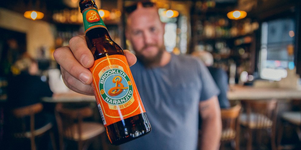
While working at Doyle Partners, I was responsible for rethinking and rebranding the beer packaging of multiple flavors. Due to an oversaturated market of artisanal beers and declining profits, Brooklyn Brewery sought a novel approach that would differentiate them from competitors and stand out on the bodega shelf.
The creative challenge was to build upon and generate an even stronger visual identity for Brooklyn Brewery’s recognizable brand. We have the utmost respect for Milton Glaser, the graphic design icon who created the famous logo & helped make Brooklyn Brewery an internationally renowned brand. Our goal was to keep Glaser’s, iconic ‘B’ logo and utilize image & symbolism to create a multi-textured, tactile experience that would build upon the existing brand.
Our efforts to revitalize the brand involved crafting a distinctive visual narrative for each flavor that captured the essence of the beer. To maximize the visibility of Brooklyn Brewery's iconic "B" logo on the shelf, we developed packaging that preserved the integrity of the logo, regardless of the display format. The scope of this project was vast, requiring a complete overhaul of packaging for bottles, cans, 6-packs, 12-packs, mother boxes, and other formats.


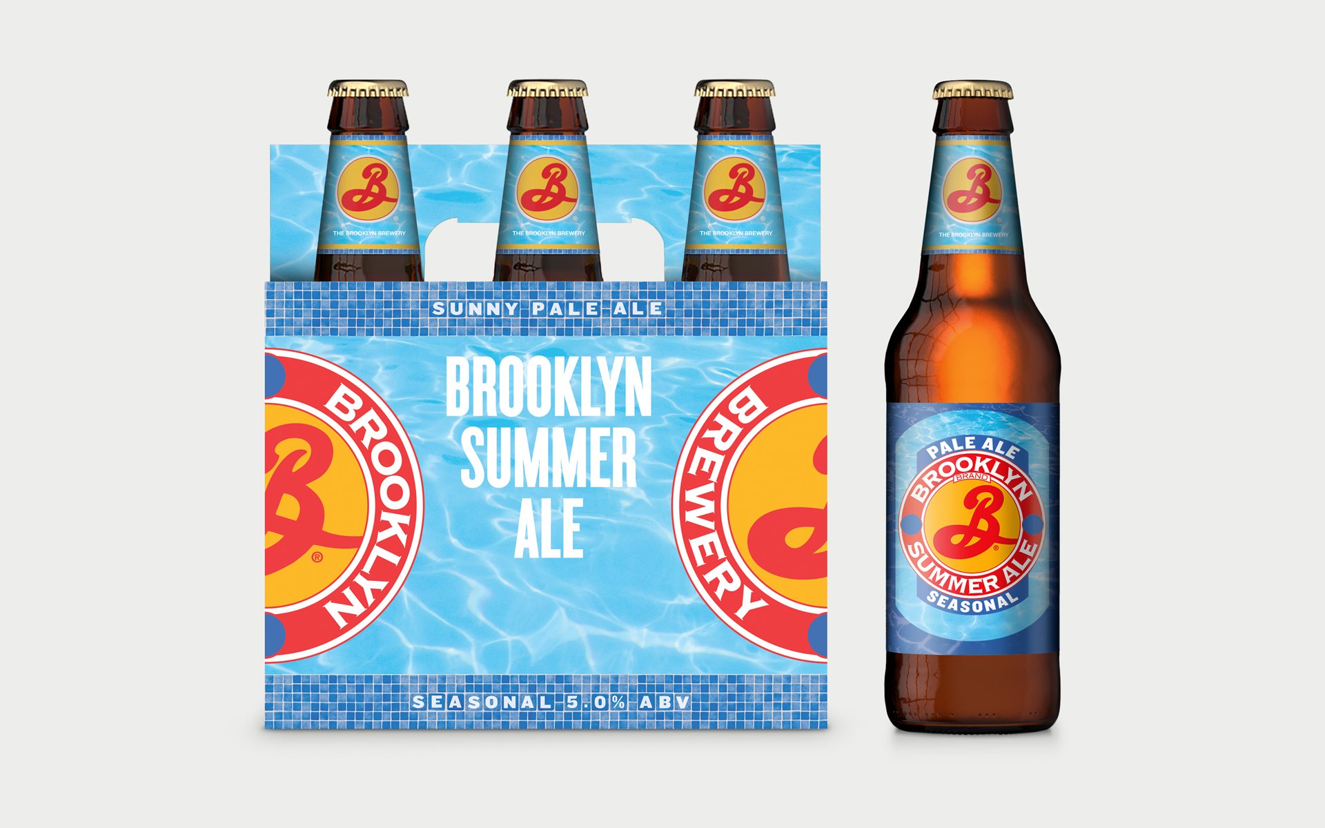


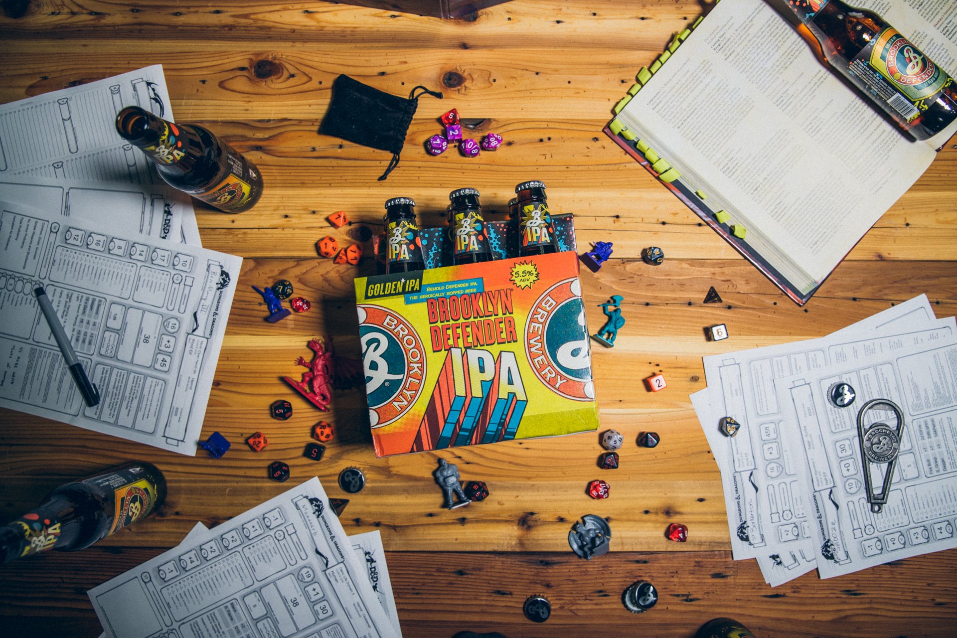


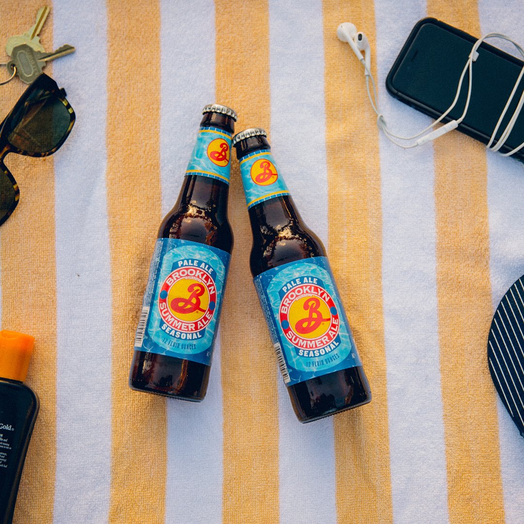




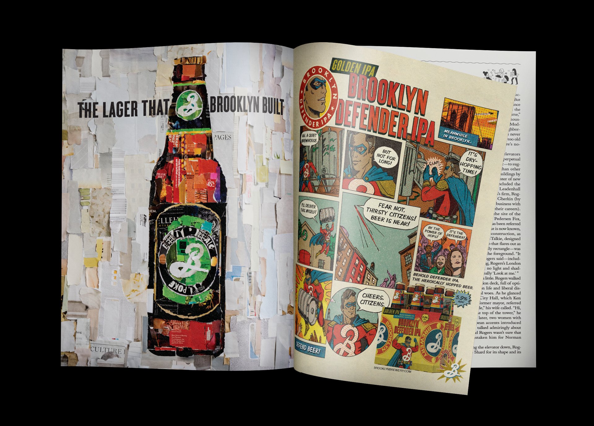


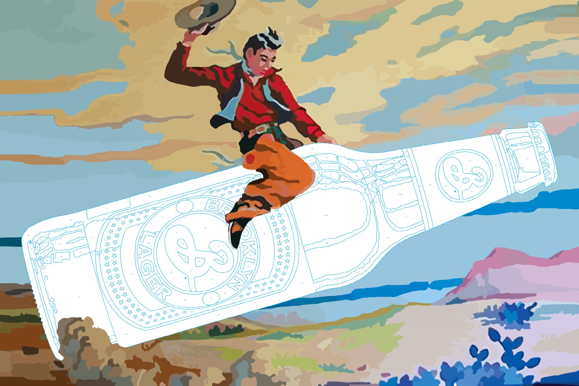
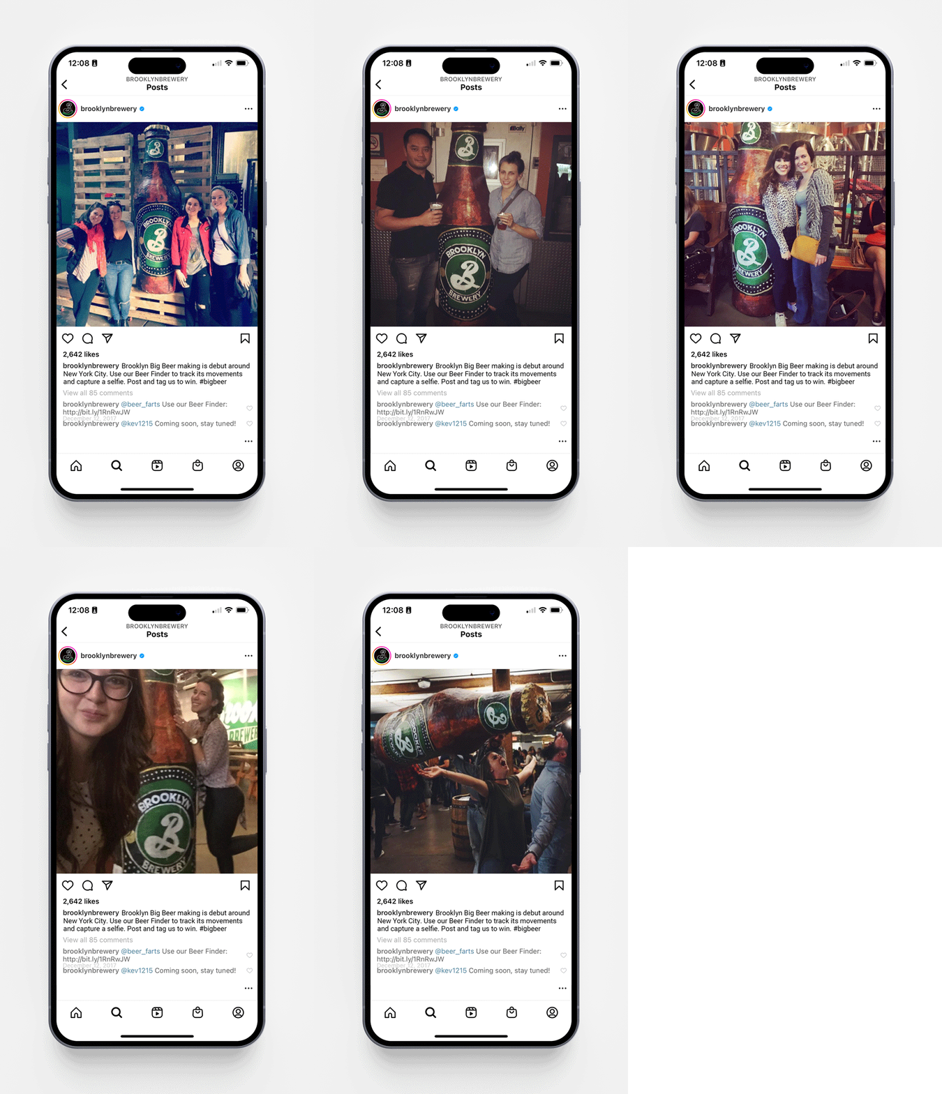
Design should be fun. Brooklyn Brewery gave us the freedom to infuse a sense of playfulness and creativity into our design approach. We developed vibrant collages featuring the distinctive beer bottles, repurposed the iconic "B" logo as a mosaic of Lego pieces, and even designed large-scale paint-by-numbers for promotional events and parties. To generate buzz on social media, we constructed a 7-foot papier-mâché replica of the Brooklyn Beer Bottle and took it for a ride on the New York City Subway, encouraging people to take selfies with it along the way.



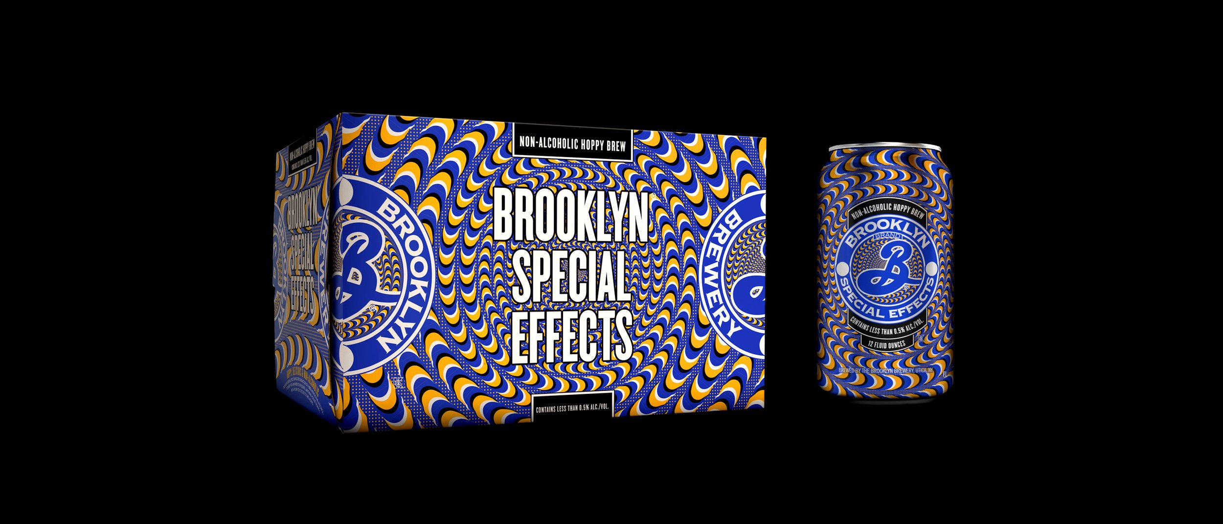
In the second round of our collaboration with Brooklyn Brewery, we took on a new creative challenge: the branding of Brooklyn Special Effects, the non-alcoholic beer. Having successfully rebranded over 14 flavors of their main beer collection, Brooklyn Brewery sought to stay ahead of the curve in response to the growing popularity of non-alcoholic beer. We seized this opportunity to push our creative boundaries even further.
I was tasked with creating packaging for Brooklyn Brewery's three initial non-alcoholic beers: Brooklyn Special Effects, Brooklyn Party Trick IPA, and Brooklyn Sour Cloud. It required a fresh approach, as we aimed to establish a distinct identity for these products that would set them apart from Brooklyn Brewery's alcoholic offerings and enable consumers to easily differentiate them.
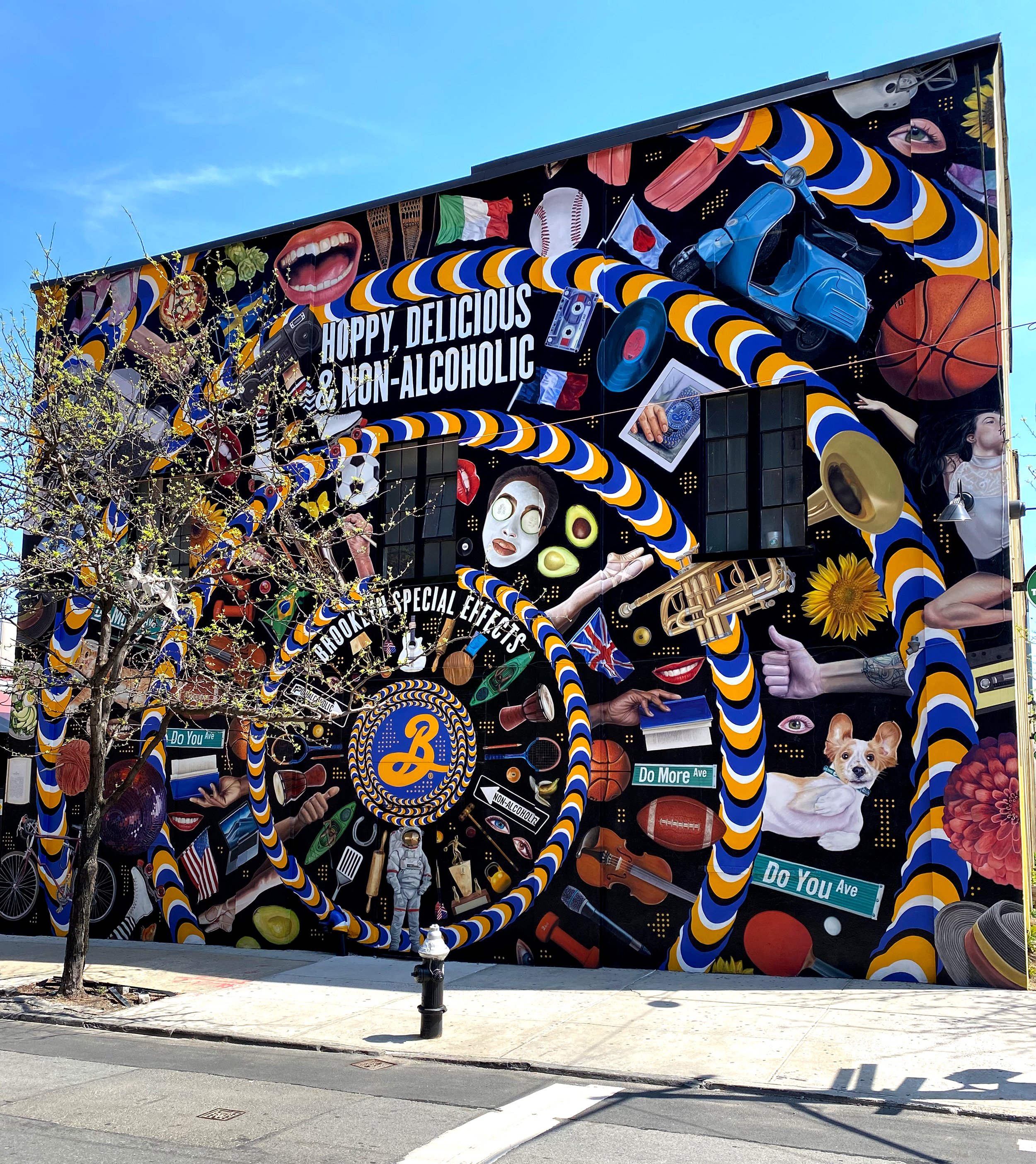
Drawing inspiration from optical illusions, I wanted to incorporate illusory motion into the packaging design, where a static image would appear to be in motion through the clever use of color contrasts, object shapes, and positioning. Essentially, I aimed to create non-alcoholic packaging that would give the viewer the perception of being drunk.
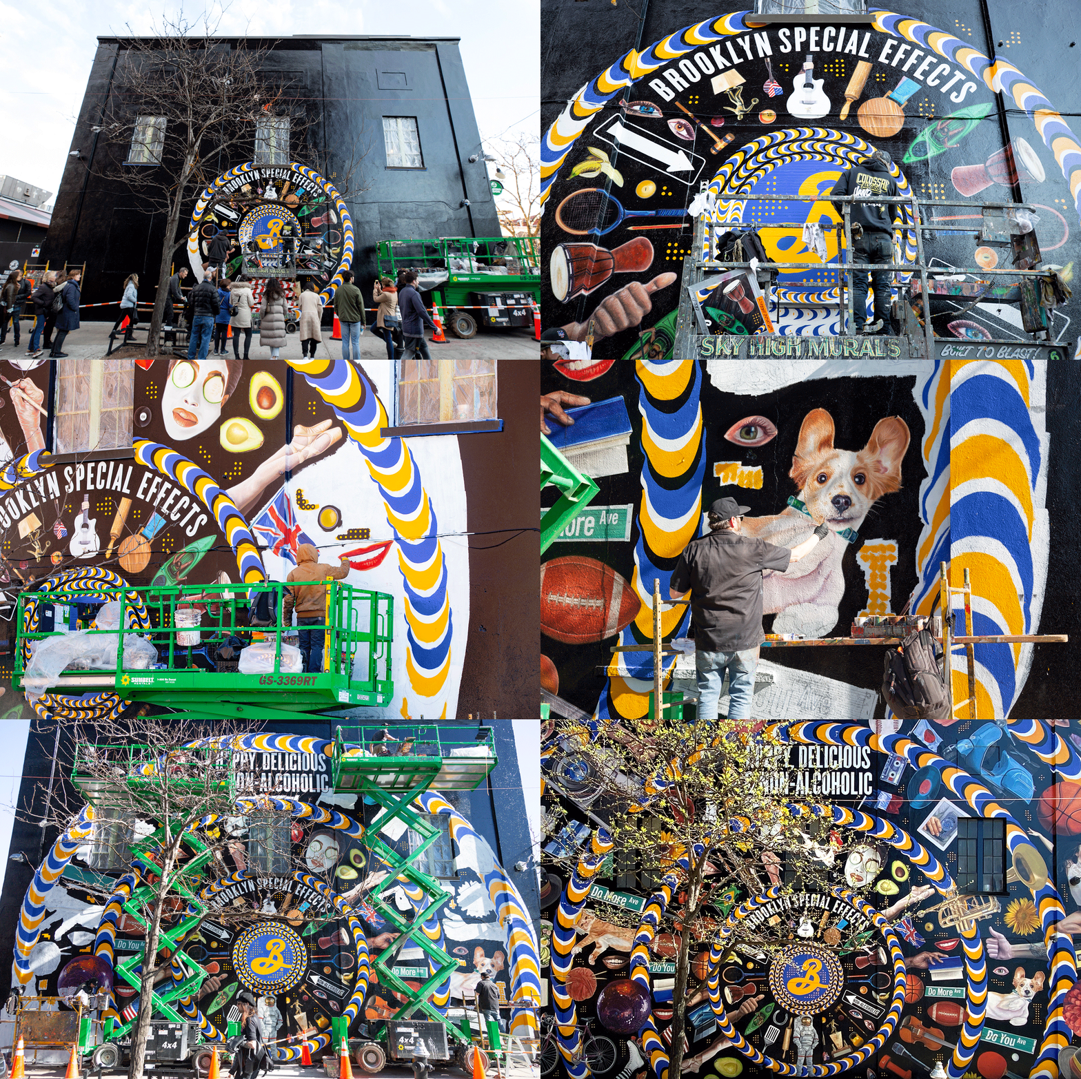
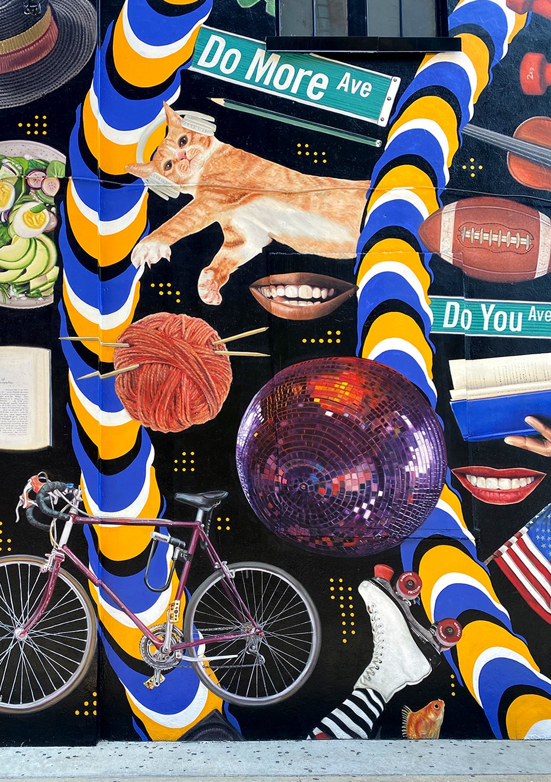
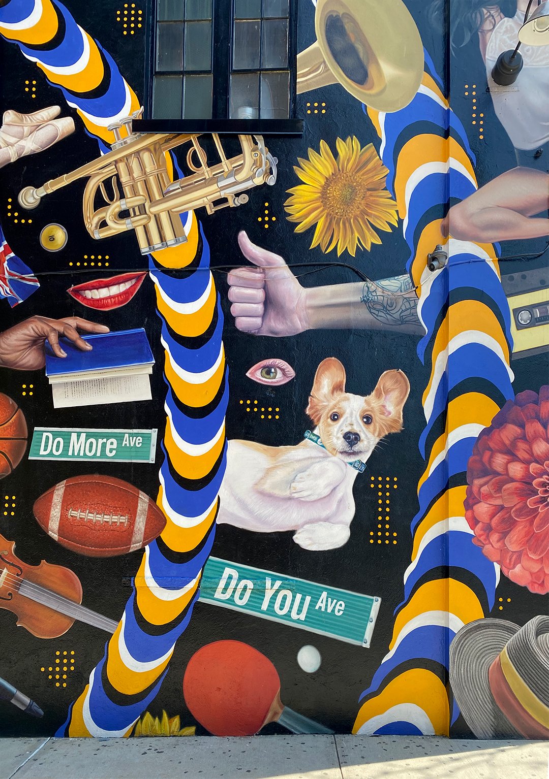
The branding we developed for Brooklyn Special Effects resonated so strongly with Brooklyn Brewery that they commissioned us to use the same visual language to create a permanent 40-foot mural on the exterior wall of their headquarters located in Williamsburg, Brooklyn.The mural showcases a range of enjoyable activities that can be performed while drinking their non-alcoholic beer collection.


Collaborators
-
Creative Director
-
Designer
-
Designer
-
Designer


